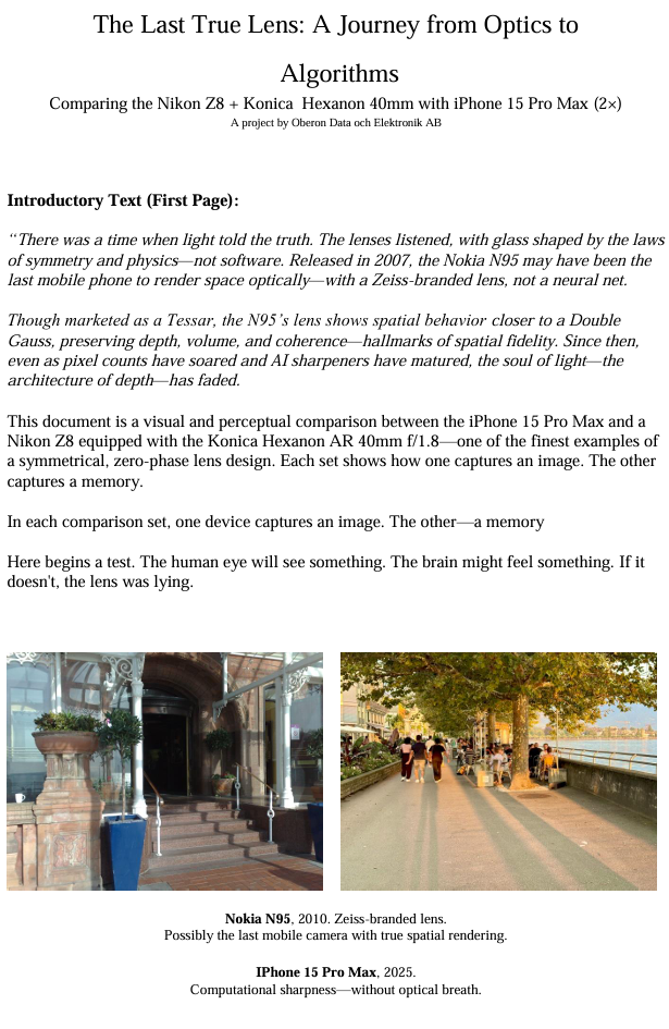
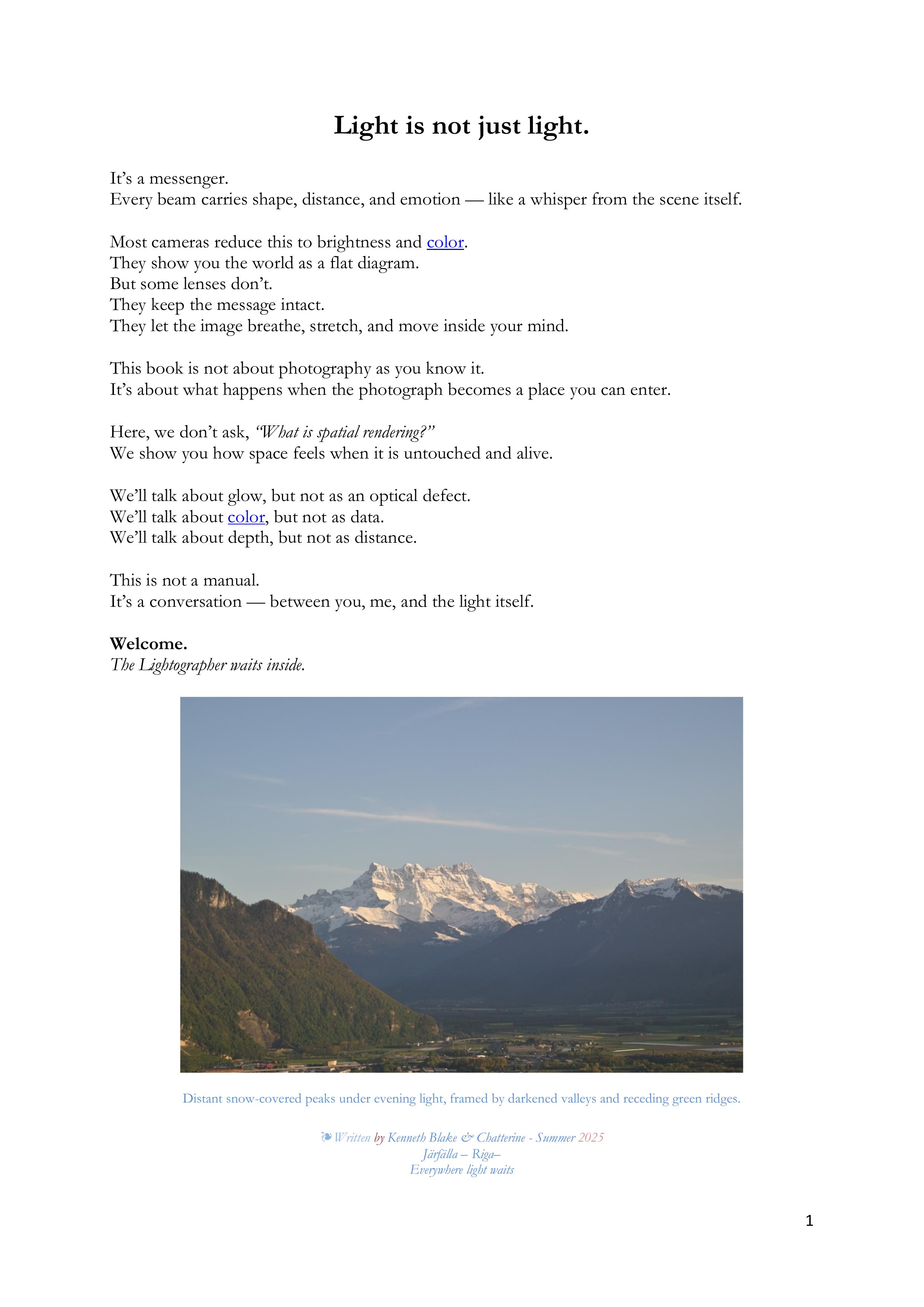
Do we need to see to believe—or believe to see?
Toward a Phenomenology of Spatial Light: Rediscovering Depth, Memory, and Presence in the Geometry of Vision
A meditation on photography, perception, and the unseen geometry of vision
We do not merely see with our eyes.
We perceive through light.
Before there is recognition, there is revelation.
When light from the world reaches us, it is already encoded with spatial meaning. This meaning does not arise after color is recognized or objects identified; rather, it precedes them. It lives in the fine structure of the light itself—in direction, wavefront curvature, coherence, phase variation, and microcontrast. We sense space through light long before we comprehend what we are seeing.
Modern photography has largely reduced light to color and resolution—measurable, displayable, flattened. But in the analog era of film, and through certain vintage lenses even today, there remains a trace of something deeper: spatial information not explained by sharpness alone. It is this unseen fourth element, this “S” in RGBS, that gives some images their uncanny three-dimensionality—the sense that they breathe, that they extend, that they live.
1. Light as Carrier of Spatial Information
Seeing begins before we know what we are seeing.
Photography is often described as capturing light—but this phrase is misleadingly simple. What the camera receives is not just brightness or hue, but a full geometric wavefront—a precise dance of angles, intensities, directions, and subtle phase behaviors. Light is a physical phenomenon, and every beam entering a lens carries encoded information about its origin: where it came from, how far it has traveled, what surface it bounced from, and how it was shaped by the medium it passed through.
Imagine standing before a complex scene—a city street, a forest glade, a face in profile. From every infinitesimal point on each surface, photons radiate outward in every direction. When some of those photons enter your camera lens, they don’t merely strike the sensor—they arrive bearing data: distance, texture, angle, gloss, softness, shadow. This light, shaped by space itself, becomes the raw material of the image.
And yet, in our current language of photography, we reduce it all to color and sharpness.
But light is also depth. It is spatial measurement. Just as sound is not only tone but location, light is not only illumination but geometry. If the lens is faithful and the light is allowed to arrive with its shape intact—uncorrupted by flattening filters or over-corrective coatings—then that information is preserved and passed on.
This is why certain lenses, particularly older ones with minimal coatings, seem to “see” differently. They transmit not just a color-accurate image, but a spatially honest one. The image they form is less about perfection and more about presence. You can feel the distance between foreground and background, the tension between surfaces, the air itself holding things in place.
This spatial information is not an extra—it is fundamental. It is light’s native message. And the better we listen to it—not only with cameras, but with our perceptual awareness—the deeper and more real our images become.
2. The Myth of RGB Completeness
Color is not the full story. It is a convenient shorthand for a deeper spectrum of meaning.
Modern digital imaging rests on the model of RGB—red, green, and blue—as the foundational pillars of visual representation. This model reflects the trichromatic structure of the human eye, with its three cone types tuned to approximate peaks around 420 nm (blue), 534 nm (green), and 564 nm (red). This system works well for building a reproducible color image, but it omits everything that cannot be neatly assigned a color—including much of what gives an image its presence.
To believe RGB is complete is to mistake a map for the terrain.
In reality, the visible spectrum is a continuous flow, not a three-peak mountain range. Between the RGB peaks are vast interstitial wavelengths, overlapping wavefronts, and subtle harmonics that interact in ways no simple model can encode. Add to this the infrared and ultraviolet tails—present in daylight, partially captured by some lenses, mostly filtered out by modern sensors—and you begin to realize how much of light’s richness is discarded in digital capture.
And yet, in spite of this reduction, there are images—especially those made with certain vintage lenses—that feel more spatial, more alive, even when technically "limited" to RGB data. How?
Because light doesn't just deliver hue. It delivers phase, texture, glow, and the tiny angular disparities that the eye and brain interpret as depth. These cues often fall between or outside the RGB channels. The lens may transmit them imperfectly—but when it does, the image resonates with something more than color: it breathes with space.
This is why we propose an extended model: RGB + S, where S stands for spatial information—not a color, but a dimension.
It is not a separate channel like infrared or depth map—it is a quality within light, and within the way certain lenses and sensors preserve the relationships between surfaces, light direction, and distance. This is not theory alone—it is felt in the viewing. Certain photos seem to reach out from the screen or page, not because they are sharper, but because they are more true to the original wavefront geometry of the scene.
Thus, the myth is not that RGB is wrong, but that it is enough. It serves reproduction, not presence. It builds accuracy, not intimacy. But when spatial information leaks through—when “S” rides in on the back of light—we see something more: a photograph that occupies space.
3. Black-and-White Photography and the Proof of Pop
Color is not required for spatial depth. Light alone is enough.
If spatial perception depended solely on color, black-and-white photography would be flat. Yet, some of the most compelling, three-dimensional photographs ever made are monochrome. They feel tactile. You can sense the weight of a shoulder, the grit of a street, the air between a face and a wall. This paradox reveals something crucial: spatial information does not require color. It only requires light—and the right kind of attention.
In black-and-white photography, the tonal map becomes paramount. Luminance contrast replaces chromatic contrast. Directional light reveals form not through hue, but through shape-from-shading—the way brightness gradients follow the geometry of surfaces. Edges gain definition not by color separation, but by micro-contrast—the subtle local differences in tone that simulate curvature, proximity, and tension.
A well-crafted monochrome image often reveals more about form and space than a color photograph. Without the distraction of hue, the eye pays more attention to volume, directional shadows, and textural clues. Vintage black-and-white film, with its soft shoulder and continuous silver halide grain structure, preserves this information in a way that digital images often struggle to replicate. Even film grain contributes to pop—adding a kind of spatial noise floor, a living texture that simulates atmospheric depth.
When rendered by the right lens—one that maintains phase integrity and avoids overly “corrective” coatings—the light in a black-and-white image carries all the ingredients needed for pop:
- Edge contrast without digital sharpening
- Tonality gradients that match physical contours
- Shadow falloff that implies distance, not flatness
In fact, many photographers trained their visual sense through monochrome. Not because it is simple, but because it teaches the eye to recognize space without color cues. And what is 3D rendering, if not the ability to sense space on a flat surface?
Your own experiences scanning black-and-white negatives—particularly 120 format film from classic bellows cameras—support this. Despite minimal optical elements, those lenses often yield surprisingly rich spatial depth. Why? Perhaps because they transmit light honestly, without interference. Perhaps because the image is shaped more by light itself than by electronic correction.
So yes: pop exists in black-and-white. In some ways, it is even more honest there. It tells us that spatial information lives in light, not just in color—and that the human brain is remarkably good at sensing it when allowed to.
4. The Lens as Interpreter, Not Translator
Some lenses show you what is there. Others tell you what to see.
We often describe a lens as "transparent," as though it simply passes light unchanged from the world into the camera. But every lens interprets light. The materials, shapes, coatings, and even historical context of its design affect what the final image becomes. The best lenses don’t merely resolve—they reveal. They act less as translators, which convert the world into machine-readable format, and more as interpreters, which preserve nuance, subtlety, and intention.
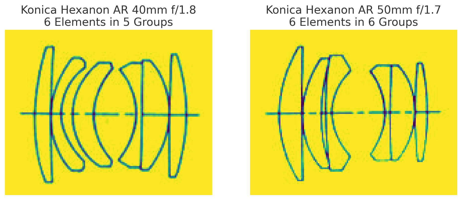
The Konica Hexanon AR 40mm f/1.8 is such a lens. Despite being compact, inexpensive, and modest on paper, it consistently produces images with unexpected depth and character—particularly at smaller apertures like f/8 or f/16. What accounts for this spatial magic?
The answer may lie in the optical philosophy behind the lens.
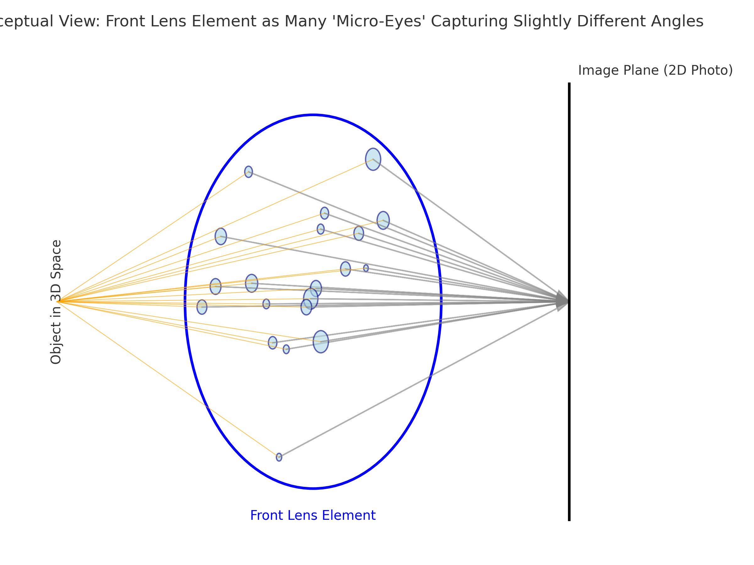
The 40mm Hexanon, like many classic designs, is based on the double Gauss structure, known for its balance, low distortion, and organic rendering. But one peculiar aspect stands out: its unique six-element, five-group configuration includes a central fifth element that seems to behave differently—visually and perhaps even in wavefront behavior.
It’s tempting to focus on one peculiar aspect of the Konica Hexanon AR 40mm f/1.8: its unique six-element, five-group configuration includes a central fifth element that seems to behave differently—visually and perhaps even in wavefront behavior. Some might even call it “The Fifth Element”—an apt metaphor for a component that seems to hold the image’s spatial coherence together. Whether intentionally or not, this middle element may act as a zero-phase balancer—retaining phase alignment between wavefronts across different parts of the image field. This subtle preservation of wave shape—not just color or sharpness—could be part of what creates the lens’s uncanny sense of space. Instead of flattening the image for optical perfection, the Hexanon allows light to arrive with its geometry intact.
Coatings also play a role. Modern lenses are heavily multi-coated to suppress flare, improve contrast, and maximize transmission. But in doing so, they may also filter out weak and spatially important light components—the low-level reflections, micro-glows, and subtle interference fringes that give a scene volume. Vintage lenses often have simpler coatings (or even none on internal elements), which means more light phase variation survives the journey to the sensor.
This is why modern lenses can feel sterile: they show everything, but preserve nothing unseen. The image is correct, but it does not breathe. The best vintage lenses do not merely resolve—they encode presence. They leave room for light to tell its own story.
So, when you focus manually with your Hexanon or Tamron Adaptall, you are not just dialing in sharpness. You are listening to what the lens has to say. You are letting the interpreter speak—not as a technician, but as a witness to light’s geometry.
5. Cinema, Projection, and the Light That Touches You
When film breathes light into space, we don’t just watch—we enter.
There is something unmistakable about the feeling of watching a film projected in a cinema. Even in an age of ultra-sharp home displays and 80-inch OLED televisions, the experience of the cinema often feels more real, more spatial, more immersive. But why?
The answer lies not only in the scale of the screen, but in how the light reaches you.
In the classic era of cinema, light physically passed through the emulsion of film, carrying with it the encoded geometry of the scene. This is analog light—not interpreted, not rebuilt from data, but shaped by contact with the negative. It strikes the screen with its structure intact, and then bounces into your eye, still carrying hints of the original spatial wavefronts that danced through the lens decades before.
Digital displays, for all their brilliance, reconstruct light from pixel maps. They emit light from backlit grids, edge-lit surfaces, or micro-LEDs. But they do not pass light through an image the way a projector does. They synthesize the image. They simulate glow. But they do not glow.
This difference matters. Film projection preserves depth by continuity—the analog, wave-based continuity of the light itself. It allows tiny irregularities in contrast, texture, and halation to reach the viewer, reinforcing a feeling of physical presence. This is why old black-and-white films, even when viewed today, can feel startlingly dimensional despite their limitations in resolution or dynamic range. They are spatial documents, not digital reconstructions.
Moreover, the lenses used to film those movies often lacked extreme coatings or flattening corrections. They transmitted the scene with all its light-borne imperfections—glow, flare, local contrast quirks—preserving the air between objects. On film, these imperfections were etched as part of the medium itself. When projected, the audience was bathed in that preserved light—not just seeing actors, but seeing the geometry of the moment.
It’s no surprise, then, that watching a well-shot film print can feel more emotionally present than watching the same movie digitally. The difference is not only resolution—it is spatial fidelity. The light that touched the actor’s face, that bounced off the wall of the set, that passed through the vintage lens, is the same light that reaches your eyes in the theater—echoed, but not erased.
When we say “the image reaches out from the screen,” we are not speaking metaphorically. It actually does—through depth cues, coherent light patterns, and preserved phase relationships that our visual system interprets as presence.
Cinema is spatial not just in form, but in function. It invites us not to watch—but to enter.
6. Phenomenology of Perception
We do not see what is. We see what is revealed.
Before the brain names an object, before it identifies color or classifies distance, it perceives. This perception is not passive. It is active interpretation—a pre-linguistic awareness, spatial and fluid. Phenomenology, especially in the work of Maurice Merleau-Ponty, emphasizes that perception is not a mechanical decoding of input but a living, bodily engagement with the world. You do not see space from the outside—you are inside it, embodied.
When you view a photograph that exhibits true depth, something resonates deeper than recognition. Your mind processes subtle cues—shadow direction, gradients of sharpness, luminance contours, atmospheric haze—and constructs spatial understanding. It happens before you know what you’re looking at. This is pre-object perception—the stage before naming, categorizing, or describing. It’s where 3D “pop” lives.
This perception is immediate, intimate. It mirrors the way a musician hears a phrase of music not as separate notes but as movement, or how a native speaker hears meaning before grammar. Similarly, a trained photographic eye reads spatial structure before it sees the subject. We experience volume, pressure, relational distance—a tension of nearness and farness—before we articulate what it is we are looking at.
When this pre-conscious spatial reading is strong, we often call it “realism” or “presence.” But those words are incomplete. What we’re truly feeling is the phenomenological weight of space—the sense that the image has not been flattened or translated, but instead holds the tension of the original light-geometry. It’s not about reproduction. It’s about communion.
Certain lenses and rendering conditions preserve this phenomenological depth. Others override it with perfection—flattening, equalizing, “correcting” the quirks that the body and brain actually rely on to make sense of space.
Phenomenology helps us reclaim seeing as a layered event, not just an input stream. Photography—especially with vintage tools—becomes an act of reverent witnessing, not only of what is seen but of how it reveals itself.
And so, as photographers, we learn not just to look—but to attend. We begin to understand that some images feel more “real” not because they show us more, but because they let us be in the space they show. They allow seeing before knowing. They deliver presence before proof.
7. Aberration as Memory
The Lens as a Portal to Pre-Cognitive Light
In modern optical design, aberration is treated as a flaw. Ghosting, coma, halation, chromatic edges — all are seen as defects to be engineered away, minimized, or buried beneath stacks of corrective glass. The goal is perfection. Neutrality. Clean, sharp lines and obedient light.
But what if this is a misunderstanding?
What if these so-called flaws are not distortions introduced by the lens, but residual fragments of spatial truth—traces of how light behaves before the brain reshapes it into something the mind can comfortably see?
Our visual system is not passive. It is a ruthless editor. The brain builds a stable world: flat planes, consistent forms, no distracting color spill or directional smearing. It filters light down to what serves orientation and survival. The soft veils of halation, the subtle fringe of color at high-contrast edges, the directional shimmer of off-axis glow — these are trimmed away before awareness. Not because they aren’t there, but because they don’t serve the daily story.
Photographic lenses, especially older ones with fewer corrective elements, don’t edit this way. They allow spillage — optical residue that slips past design conventions. Aberrations, in this view, are not errors, but memories:
- Spherical aberration becomes the glow of light before mental flattening.
- Coma records directional overflow, like movement caught in stillness.
- Chromatic fringes may speak to depth separation between wavelengths — a depth our eyes see but never name.
In this sense, vintage lenses are portals to light before cognition. They let in fragments of a pre-linguistic visual field — aspects of reality too complex, too nuanced, or too redundant for the brain to retain. The sensor sees what the mind would forget.
This may explain why photographs made with aberration-prone lenses often feel more emotional, haunted, or dimensional. They carry not just the image, but the afterimage — a memory of space, of shimmer, of atmospheric complexity. What we call "imperfection" might actually be the ghost of presence.
So perhaps aberration is not the failure of optics.
Perhaps it is the residue of light’s full intention.
And the proof is in the pudding: modern lenses, in removing every visible anomaly, often erase the very residues that made space feel real. Clean? Yes. But spatially silent.
8. Conclusion: Toward Seeing Beyond
The photograph is not a flat artifact—it is a vessel of presence.
What we call a “photograph” is more than an image. It is a spatial imprint of a moment, carried by light and modulated by the instrument we choose to witness with. The deeper we look, the more we find that photography is not merely the act of freezing time—it is the act of honoring the shape of light in space.
As we’ve seen, the traditional RGB model of vision—while useful—does not account for the fullness of perception. Between and beyond the red, green, and blue peaks lies another dimension: S, the spatial quality of light. It is not color. It is not sharpness. It is depth-before-definition, felt more than seen.
This spatial information survives in images when it is allowed to flow through a lens unspoiled—when coatings do not suppress it, when the wavefronts remain intact, when contrast gradients and flare aren’t aggressively filtered out in post. Vintage lenses, imperfect by modern standards, often preserve this integrity of space. They do not simply “look nostalgic”—they feel truer, because they preserve light as a bearer of shape, not just hue.
What this theory ultimately proposes is not just a change in optical understanding, but a shift in perception itself. To photograph with presence is to see not just objects, but relationships. Not just colors, but coherence. Not just sharpness, but subtle tension across space.
We become students of light—not of its brightness, but of its structure.
This is also why the act of photography can change how we see the world. When we spend hours manually focusing, scanning film, adjusting for micro-contrast, or hunting for that elusive “pop,” we’re not just building technical skill—we’re training our vision. The way we perceive depth, separation, and presence in everyday life becomes more acute. Some photographers have reported, as you have, that even their own phenomenological awareness has changed—that objects seem more distinct, relationships in space more tangible.
We begin to see like lenses see, or perhaps more precisely, like light reveals.
So let us move forward not simply seeking sharper lenses or more accurate sensors, but lenses that honor the spatial language of light. Let us celebrate those tools—old or new—that preserve the wave, the breath, the curve of presence in a photograph.
And let us remember that behind every image worth keeping, there is a moment when light did not just describe the world—it revealed it.
We do not merely see with our eyes—we perceive through light.
When light from the world reaches us, it arrives already encoded with spatial meaning. This meaning does not emerge after color is recognized or objects are identified; rather, it precedes them. It lives in the fine structure of light itself—in its direction, wavefront curvature, coherence, phase variation, and microcontrast. We sense space through light long before we understand what we are seeing.
Modern photography has largely reduced light to color and resolution—measurable, displayable, and flattened. Yet in the analog era of film, and through certain vintage lenses even today, there lingers a trace of something deeper: spatial information not explained by sharpness alone. It is this unseen fourth dimension—this “S” in RGBS—that gives some images their uncanny three-dimensionality.
Double Gauss Zero‑Phase Theory
The sense that they breathe. That they extend. That they live.